Mom Pops / Package Design
Illustration, Package Design, Branding
Client:
Mom Pops
Location:
USA, Pennsylvania
Year:
2023

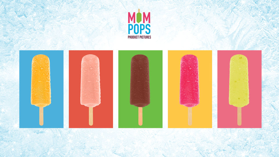
Mom Pops, the beloved brand known for its refreshing ice pops, embarked on an exciting journey to transform its packaging from basic to extraordinary. The result is a stunning makeover that not only makes each ice pop look delicious but also distinctly showcases the flavor. Bold, vibrant colors take center stage, harmonizing when displayed together, while intricate fruit imagery adds an irresistible touch of realism. The redesigned icons unify the entire product line under one coherent visual language.
The driving concept behind the Mom Pops package redesign was to create an eye-catching and appetizing visual identity. Each flavor was given its own unique color scheme to stand out and evoke the essence of the ingredients used. The addition of fruit images brings a mouthwatering realism to each ice pop, making them nearly irresistible. The ice effect in the background enhances the frozen appeal, and when multiple flavors are displayed together, they form a visually pleasing harmony.
Each flavor is adorned with bold and vibrant colors, immediately capturing attention and reflecting the freshness of the ingredients. Whether it’s the enticing orange hue of the mango-flavored ice pop set against a vivid blue background or the striking green backdrop of the Chocolate Sea Salt flavor that makes the brown ice pop stand out, these colors make identifying flavors a breeze.
Every ice pop package features intricate, lifelike fruit images that unmistakably represent the flavor inside. The vivid strawberries, zesty lemons, and lush raspberries practically jump off the packaging. The subtle ice effect in the background adds a frosty touch, accentuating the cool and refreshing nature of the ice pops.
The newly designed icons share a cohesive design language, ensuring consistency across the entire product line. These icons fit together seamlessly, like pieces of a puzzle, offering something for everyone.
Mom Pops’ package redesign is a masterful transformation, turning simple ice pops into enticing works of art. The bold colors and realistic fruit imagery tell a story of flavor and freshness. Whether enjoyed individually or as part of a colorful ensemble, Mom Pops’ new packaging harmonizes the joy of frozen treats with the excitement of bold design.


