Variel
/ Branding
Branding, Logo Design, Brand Guideline, Illustration
Client:
Variel
Location:
USA, California
Year:
2022

Variel is a fitness product that transforms how individuals conduct strength and training, it is the next generation of workouts. It is a product that combines the future with the now. We needed to design a logo that was futuristic, bold yet minimalistic.

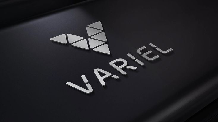
Variel is a niche product which is why it needs to stand out from its competitors. It has to be eye-catchy, modern, dynamic but also cool. It needed a recognizable strong icon - so that when the logo isn’t used it can easily be identified, like the Nike tick or the 3 stripes of Adidas. We made use of the letter “V” because its form and presence are strong, therefore making it memorable. We designed the “V” icon made of smaller triangles representing the spine which is an essential component of good posture. The Variel symbol is the key building block of its identity, it is the primary visual element that identifies the brand. The “V” stands for connection, performance, and progress.
In contrast to this firm shape we used a soft modern typeface that has been described as “legible without being neutral, nuanced without being fussy, and expressive without being distracting.” Its flexible and smooth-flowing characters give a harmonious balance between the icon and the type. We also added a wave through the typography to give a feeling of movement and rhythm like our bodies do. The logotype is a powerful graphic evoking the culture of the brand - the connection between active and exciting communication. In the end, we made a logo that has the perfect balance between power and flow.


