Fit Therapy / Branding
Branding, Logo, Guideline
Client:
Fit Therapy
Location:
Turkey, Istanbul
Year:
2019

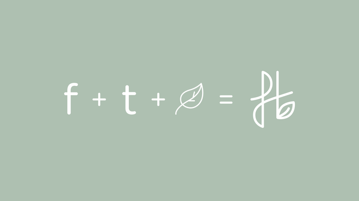
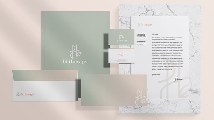
The Fit Therapy team knew they wanted something that was “natural” and “soothing” so we started by gaining an understanding of who the team wanted to target, what they wanted the brand to stand for, and where they wanted it to go and then we went all-out with our branding ideas, playing around with a bunch of different logos and designs until we found something that really made sense for the company. For a recognizable logo, we landed on a contemporary font and graphics that were indicative of both points on a grid and pathways.

The colors were inspired by the nature itself: neutral base colors with pops of color in strategic areas to draw attention to certain features (i.e., the brand identity) while blending into their environment at the same time. Starting with a clear and compelling strategy that gave the brand a competitive edge, we crafted a holistic, honest and transparent concept with a warm, welcoming tone. We overhauled the brand messaging including the mission, vision, and core values. Representing the brand’s organic ingredients; nutritional and humanly healing for thus we selected an earthy color palette and typography that evoked both therapeutic and curative.


